

Orig.Developer : Bugbear Entertainment
Port Developer : Bugbear Entertainment
               :
Genre          : Racing games
Graphics       : High-dynamic-range rendering
Release Info   : Free with PlayStation Plus
                 Developed in Finland

Port of
  Wreckfest (2019 PS4)

Trophies       : truetrophies.com
not completed.
Image source: playstationcountry.com
Analysis
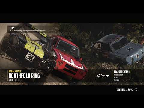
- The menus of this game is a good example of UI design that *looks* good, but doesn't convey useful information. Specifically, understanding which event you're participating in, how many races you have left, and which track you're racing on, is a constant source of confusion.